Call of Data

flowchart computer flask


The story, names, characters, and incidents portrayed in this production are fictitious.
No identification with actual persons (living or deceased), places, buildings, and products
(ahem, Call of Duty) is intended or should be inferred.


Hello [ Human ],
You have been recruited.


president


Your Mission Objective


president


Select Your Player


science_cat spaceperson blue_guy


action number one: Choose Your Parameter

A team of data enthusiasts has travelled the world to collect information on each country's Carbon footprint.
The team identified energy consumption and carbon dioxide as strong proxies for the escalation of climate change.

Your first task is to choose which parameter to measure to help president joe button.


choice one: Carbon Dioxide Produced
UNIT: Annual Tonnes of CO2_equivalent per Country

Argument For Selection: Carbon dioxide is the most important of Earth's greenhouse gases. Its increasing concentration in the atmosphere causes Earth's temperature to rise; which in turn causes warming oceans, extreme weather events, and sea-level rise.

By choosing carbon dioxide, you can measure the relative increase or decrease of adverse climate change effects.


choice two: Primary Energy Consumed
UNIT: Annual TWh of Energy Consumed per Country

Argument For Selection: Globally, the use of energy represents the largest source of greenhouse gas emissions (i.e. carbon dioxide) from human activities. About two thirds of global greenhouse gas emissions are linked to burning fossil fuels for energy.

By choosing energy consumption, you can measure how country energy decisions and consumption habits have impacted climate.


action number two: Time Frame
joe button realizes that the world has changed drastically over the last century.
As we have become more technologically advanced, our energy use has changed for better or worse.

Your second task is to decide which time-frame is most useful at convincing world leaders of our impending disaster.


choice one: Long Duration {1965-2016}

Argument For Selection: A long-term study of climate change parameters allows for a more complete picture of progress (or lack thereof). It also represents the most granular data available for each parameter and thus can be used to infer enduring trends.


choice two: post Dot-Com Boom {1990-2016}

Argument For Selection: Our social and political world looks very different today than it did before the 90s. The internet changed our relationship with technology and subsequently energy (i.e. electricity). Basing any guideline for climate change mitigation on a time-scale that includes a less technologically-advanced period may be misleading.


action number three: Region of Study


As a data scientists, we know information is only as useful as it is interpretable.
To avoid inundating our busy world leaders with excessive detail, we recommend you limit your study area to only a few, critical countries.

Your third task is to choose which set of countries is most important to visualize.


choice one: Top Oil Producers

Argument For Selection: Nations with rich fossil fuel reserves are likely to be responsible for the highest CO2 emissions. Investigating their longtidunal trends may be important for global climate intervention.


choice two: Largest Populations

Argument For Selection: Since CO_2 is tied to energy and energy consumption is tied to people, then countries with large populations are important case-studies for how either climate change parameter scales over time.


choice three: Most Technologically Advanced

Argument For Selection: Technological advancement necessitates the consumption of natural resources, therefore an interesting question is whether their economies are too energy-intensive and whether they are ostensibly the largest polluters.


choice four: Most Diverse Energy Mix

Argument For Selection: Not all energy is created equal. This subset is useful for investigating the hypothesis that energy intensive countries are all bad for the environment depends on their fuel composition.


action number four: Choosing your units

President joe button is interested in observing a time series of your parameter.
There are two possible ways to visualize the longitudinal progression: (1) a growth rate or (2) absolute values.

Your fourth task is to decide how to encode your parameter time-series data.


choice one: Absolute Values

Argument For Selection: Absolute measurements avoid any assumptions around when its appropriate to set time=0. It also leaves the data in its rawest format, which allows the audience to comprehend the scale of the parameter values over time.


choice two: Relative Growth

Argument For Selection: Growth rates are better able to convey the magnitude and direction of parameters over time. For instance you can better answer if the rate of CO_2 entering the atmosphere has increased or decreased


action number five: Choosing your scale

A limitation to our visual, so far, is the measurement of only a single parameter.
As most data scientists know there are several confounding variables that may bias our observed trends.
Without overcomplicating our visuals with additional independent variables, we provide you with the option to normalize
your data by population or GDP - two variables we have previously established can effect CO_2 emissions and energy consumption.

Your fifth and final task is to decide between normalizing the data by country statistics or keeping the data in its absolute form.


choice one: Divide by Annual Population per Country

Argument For Selection: Population numbers vary widely acoss countries, without accounting for this number - possible inferences on how your parameters are changing for a particular country may be under- or overestimated.


choice two: Divide by Annual GDP per Country

Argument For Selection: A reasonable assumption is that GDP is correlated with energy production, consumption, and subsequently emissions. To make robust comparisons between countries you should eliminate the causal effect of GDP by normalizing the data.


choice three: NONE


Argument For Selection: Neither alternative provides a compelling alternative to the data's existing format.


Mission Results

BIASED DETECTED: You are

Your biases succesfully convinced Earth's leaders to !

>

Your Resulting Visualization:
Data Reveal

Resulting Visualization:


Would you have made different decisions had you been able to look at the data and it's impact on the graph? Do you think this have made the visualization more or less biased?
Toggle your decisions to view how wach of them biased the final visualization

A1: Parameter

A2: Time

A3: Countries

A4: Unit

A5: Scale
Sources

Images
Flask pixel art
Computer pixel art
Flowchart pixel art
Spaceman pixel art
Science cat pixel art
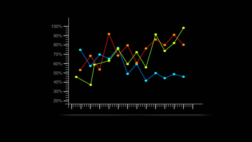
Generic line chart

Concept
Black Hat-White Hat Exercise
Disclaimer Text
Call of Duty Name Inspiration

Motivating Literature
Chapter 4: What Gets Counted Counts. Catherine D'Ignazio. Data Feminism. 2020.
Viral Visualizations: How Coronavirus Skeptics Use Orthodox Data Practices to Promote Unorthodox Science Online. Crystal Lee, Tanya Yang, Gabrielle Inchoco, Graham M. Jones, Arvind Satyanarayan. 2021
Ethical Dimensions of Visualization Research. Michael Correll. 2019

Coding
For the sidebar
For the typewriter effect
For the text reveal
For the image reveal
For the quiz structure
For the final graph structure
For the reactive axes